ShopDreamUp AI ArtDreamUp
Deviation Actions


Suggested Deviants


Suggested Collections


![[CAMP CAMP - DETROIT: BH] MAX-CONNOR](https://images-wixmp-ed30a86b8c4ca887773594c2.wixmp.com/f/87ea0f02-c612-4afb-bf6d-0a86e343bd32/dcheeks-d2d92818-c6df-4cf0-b722-d7fd9555233d.png/v1/crop/w_184,h_184,x_0,y_16,scl_0.27586206896552,q_70,strp/_camp_camp___detroit__bh__max_connor_by_thetimelimit_dcheeks-92s-2x.jpg?token=eyJ0eXAiOiJKV1QiLCJhbGciOiJIUzI1NiJ9.eyJzdWIiOiJ1cm46YXBwOjdlMGQxODg5ODIyNjQzNzNhNWYwZDQxNWVhMGQyNmUwIiwiaXNzIjoidXJuOmFwcDo3ZTBkMTg4OTgyMjY0MzczYTVmMGQ0MTVlYTBkMjZlMCIsIm9iaiI6W1t7ImhlaWdodCI6Ijw9ODk5IiwicGF0aCI6IlwvZlwvODdlYTBmMDItYzYxMi00YWZiLWJmNmQtMGE4NmUzNDNiZDMyXC9kY2hlZWtzLWQyZDkyODE4LWM2ZGYtNGNmMC1iNzIyLWQ3ZmQ5NTU1MjMzZC5wbmciLCJ3aWR0aCI6Ijw9NjY3In1dXSwiYXVkIjpbInVybjpzZXJ2aWNlOmltYWdlLm9wZXJhdGlvbnMiXX0.I6-vZGffr3tCJ2Pvb7MF35gFE5RC32wk7219DRoawqQ)
![[CAMP CAMP - DETROIT: BH] MAX-CONNOR](https://images-wixmp-ed30a86b8c4ca887773594c2.wixmp.com/f/87ea0f02-c612-4afb-bf6d-0a86e343bd32/dcheeks-d2d92818-c6df-4cf0-b722-d7fd9555233d.png/v1/crop/w_92,h_92,x_0,y_8,scl_0.13793103448276,q_70,strp/_camp_camp___detroit__bh__max_connor_by_thetimelimit_dcheeks-92s.jpg?token=eyJ0eXAiOiJKV1QiLCJhbGciOiJIUzI1NiJ9.eyJzdWIiOiJ1cm46YXBwOjdlMGQxODg5ODIyNjQzNzNhNWYwZDQxNWVhMGQyNmUwIiwiaXNzIjoidXJuOmFwcDo3ZTBkMTg4OTgyMjY0MzczYTVmMGQ0MTVlYTBkMjZlMCIsIm9iaiI6W1t7ImhlaWdodCI6Ijw9ODk5IiwicGF0aCI6IlwvZlwvODdlYTBmMDItYzYxMi00YWZiLWJmNmQtMGE4NmUzNDNiZDMyXC9kY2hlZWtzLWQyZDkyODE4LWM2ZGYtNGNmMC1iNzIyLWQ3ZmQ5NTU1MjMzZC5wbmciLCJ3aWR0aCI6Ijw9NjY3In1dXSwiYXVkIjpbInVybjpzZXJ2aWNlOmltYWdlLm9wZXJhdGlvbnMiXX0.I6-vZGffr3tCJ2Pvb7MF35gFE5RC32wk7219DRoawqQ)


You Might Like…


![[C] Deloozion](https://images-wixmp-ed30a86b8c4ca887773594c2.wixmp.com/f/ec0b3bb1-44ee-4ce4-a7c7-92fff746569b/ddlfc9w-0f243a64-04f8-434b-92d5-61b94369af00.png/v1/crop/w_184,h_184,x_0,y_41,scl_0.40888888888889,q_70,strp/_c__deloozion_by_allynkson_ddlfc9w-92s-2x.jpg?token=eyJ0eXAiOiJKV1QiLCJhbGciOiJIUzI1NiJ9.eyJzdWIiOiJ1cm46YXBwOjdlMGQxODg5ODIyNjQzNzNhNWYwZDQxNWVhMGQyNmUwIiwiaXNzIjoidXJuOmFwcDo3ZTBkMTg4OTgyMjY0MzczYTVmMGQ0MTVlYTBkMjZlMCIsIm9iaiI6W1t7ImhlaWdodCI6Ijw9ODUwIiwicGF0aCI6IlwvZlwvZWMwYjNiYjEtNDRlZS00Y2U0LWE3YzctOTJmZmY3NDY1NjliXC9kZGxmYzl3LTBmMjQzYTY0LTA0ZjgtNDM0Yi05MmQ1LTYxYjk0MzY5YWYwMC5wbmciLCJ3aWR0aCI6Ijw9NDUwIn1dXSwiYXVkIjpbInVybjpzZXJ2aWNlOmltYWdlLm9wZXJhdGlvbnMiXX0.iuioNQQf-Z4PHkqYPGpQbxopUpV6ZGgo_pfrmjx5khM)
![[C] Deloozion](https://images-wixmp-ed30a86b8c4ca887773594c2.wixmp.com/f/ec0b3bb1-44ee-4ce4-a7c7-92fff746569b/ddlfc9w-0f243a64-04f8-434b-92d5-61b94369af00.png/v1/crop/w_92,h_92,x_0,y_20,scl_0.20444444444444,q_70,strp/_c__deloozion_by_allynkson_ddlfc9w-92s.jpg?token=eyJ0eXAiOiJKV1QiLCJhbGciOiJIUzI1NiJ9.eyJzdWIiOiJ1cm46YXBwOjdlMGQxODg5ODIyNjQzNzNhNWYwZDQxNWVhMGQyNmUwIiwiaXNzIjoidXJuOmFwcDo3ZTBkMTg4OTgyMjY0MzczYTVmMGQ0MTVlYTBkMjZlMCIsIm9iaiI6W1t7ImhlaWdodCI6Ijw9ODUwIiwicGF0aCI6IlwvZlwvZWMwYjNiYjEtNDRlZS00Y2U0LWE3YzctOTJmZmY3NDY1NjliXC9kZGxmYzl3LTBmMjQzYTY0LTA0ZjgtNDM0Yi05MmQ1LTYxYjk0MzY5YWYwMC5wbmciLCJ3aWR0aCI6Ijw9NDUwIn1dXSwiYXVkIjpbInVybjpzZXJ2aWNlOmltYWdlLm9wZXJhdGlvbnMiXX0.iuioNQQf-Z4PHkqYPGpQbxopUpV6ZGgo_pfrmjx5khM)


Featured in Groups


Comments22
Join the community to add your comment. Already a deviant? Log In
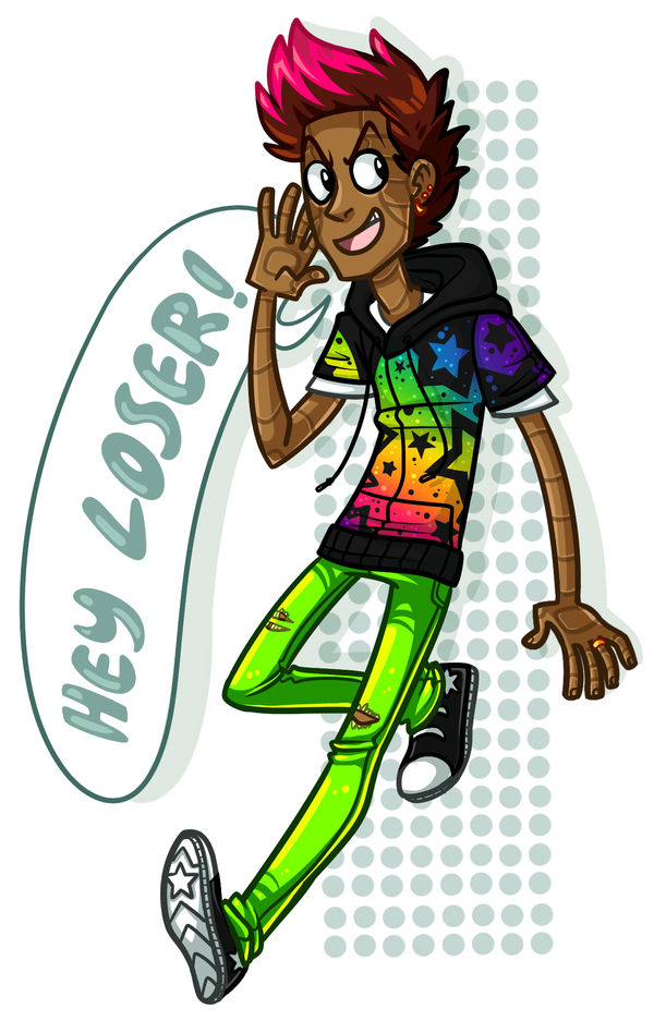
Initial Impression: I'm not a loser! You're a loser! With your weird skin... What is up with his skin? It must be a style thing, okay, nice background though. Would probably make a good t-shirt or poster design!
Perception Lines: My eyes start at his face and hand, travel down his body to his right foot and then follow the 'Hey Loser!' back up in a tidy circle. I don't even notice the dotted background until afterwards, it fills the white space nicely.
Vision: The style and emotion of this piece is obvious. The character is lively, the white space is managed appropriately.
Originality: To my knowledge this is an OC or at least not a character I am familiar with. The skin and coloration is interesting and executed well. The framing as if for a poster is spot on for the emotions of the character here.
Technique: The art is very stylized, the coloration is well done and keeps attention on the subject. There's only a few things like the angle of the speech bubble which I think could be a little less tight allowing for a wider circle of perception. Also the shadow cast by the hair is a little to thick and detracts from the good job you did there. Same with the right arm, shadow thickens to much.